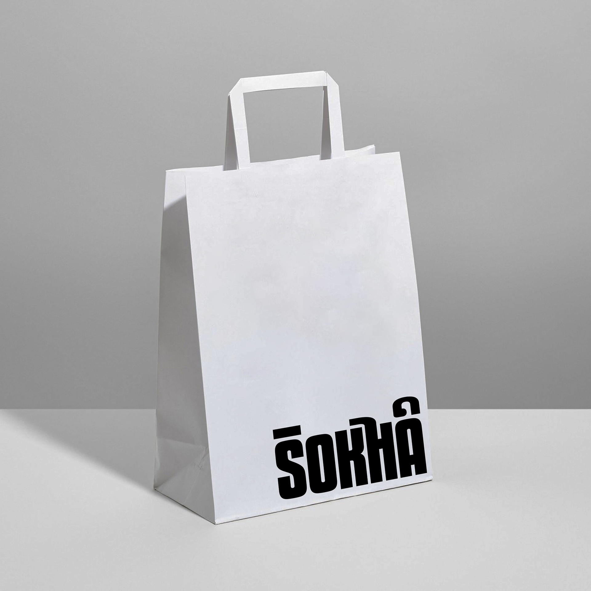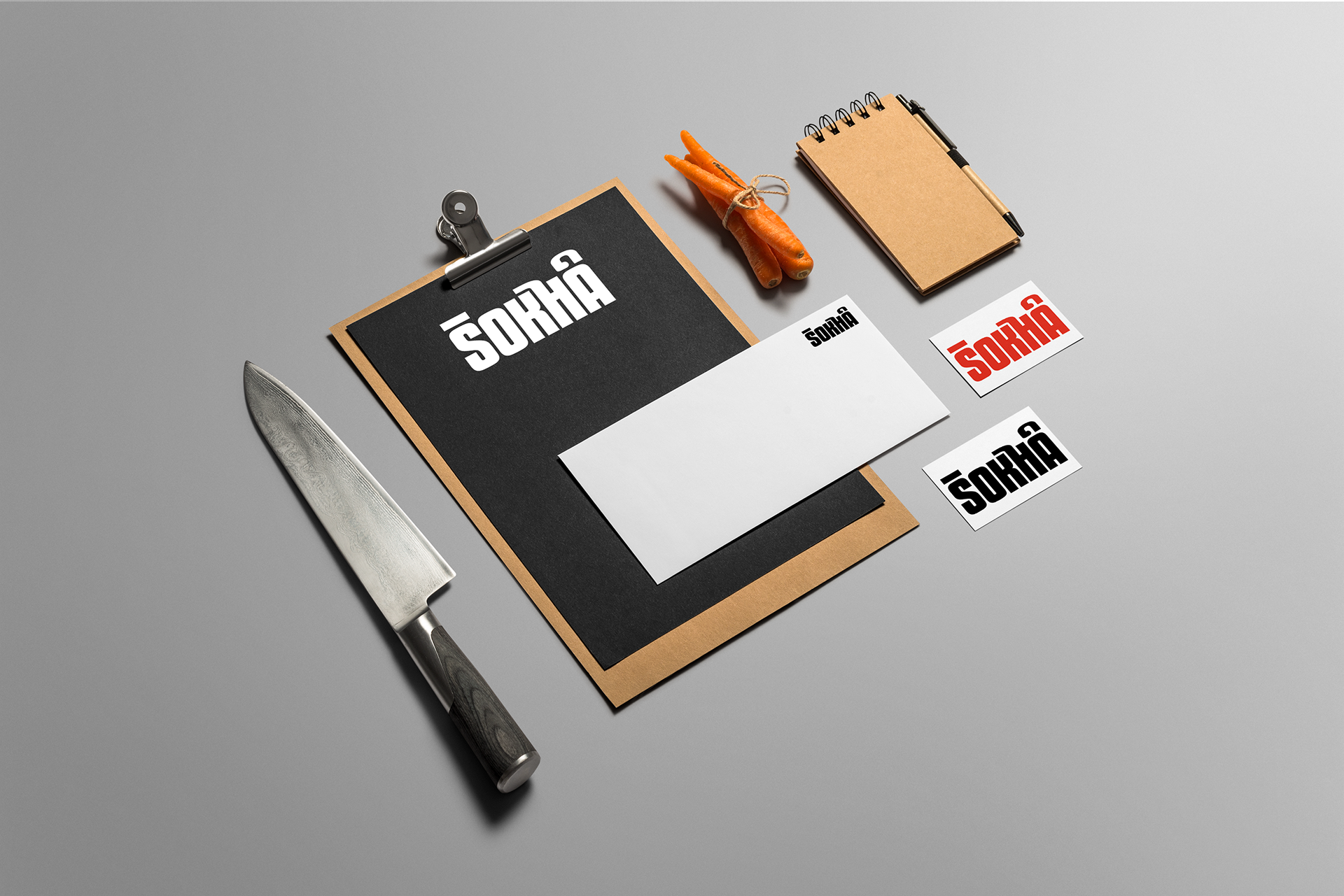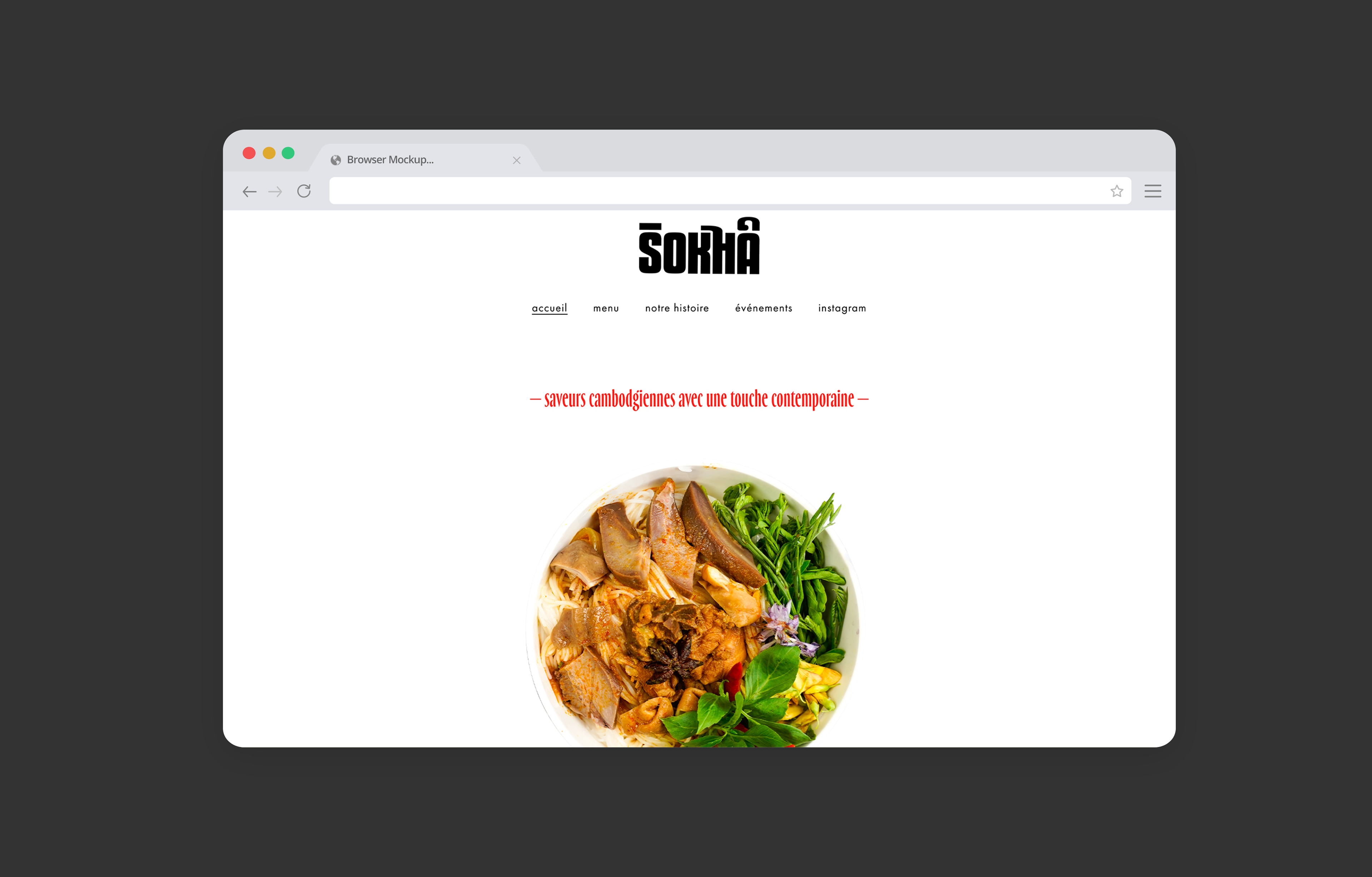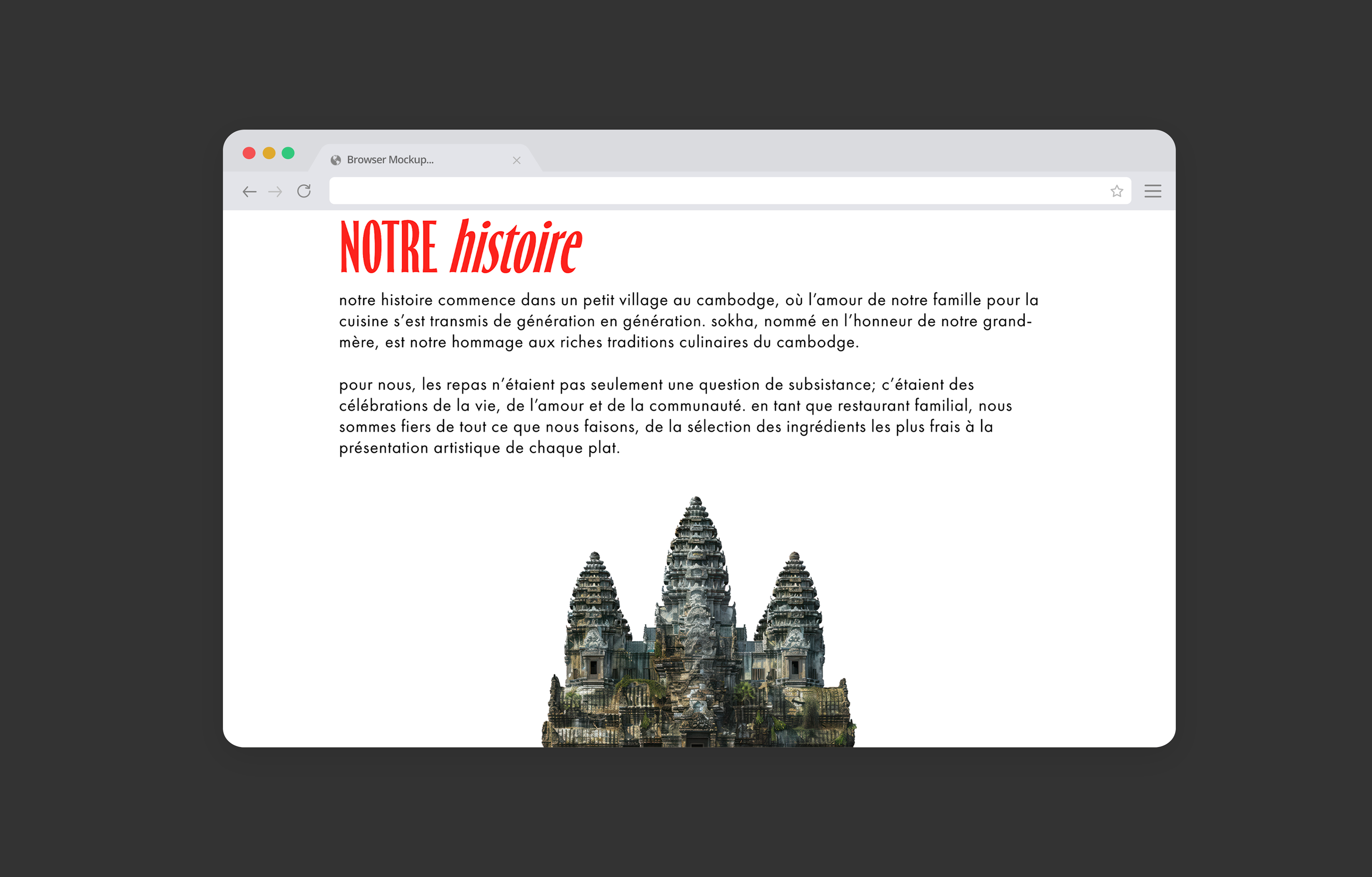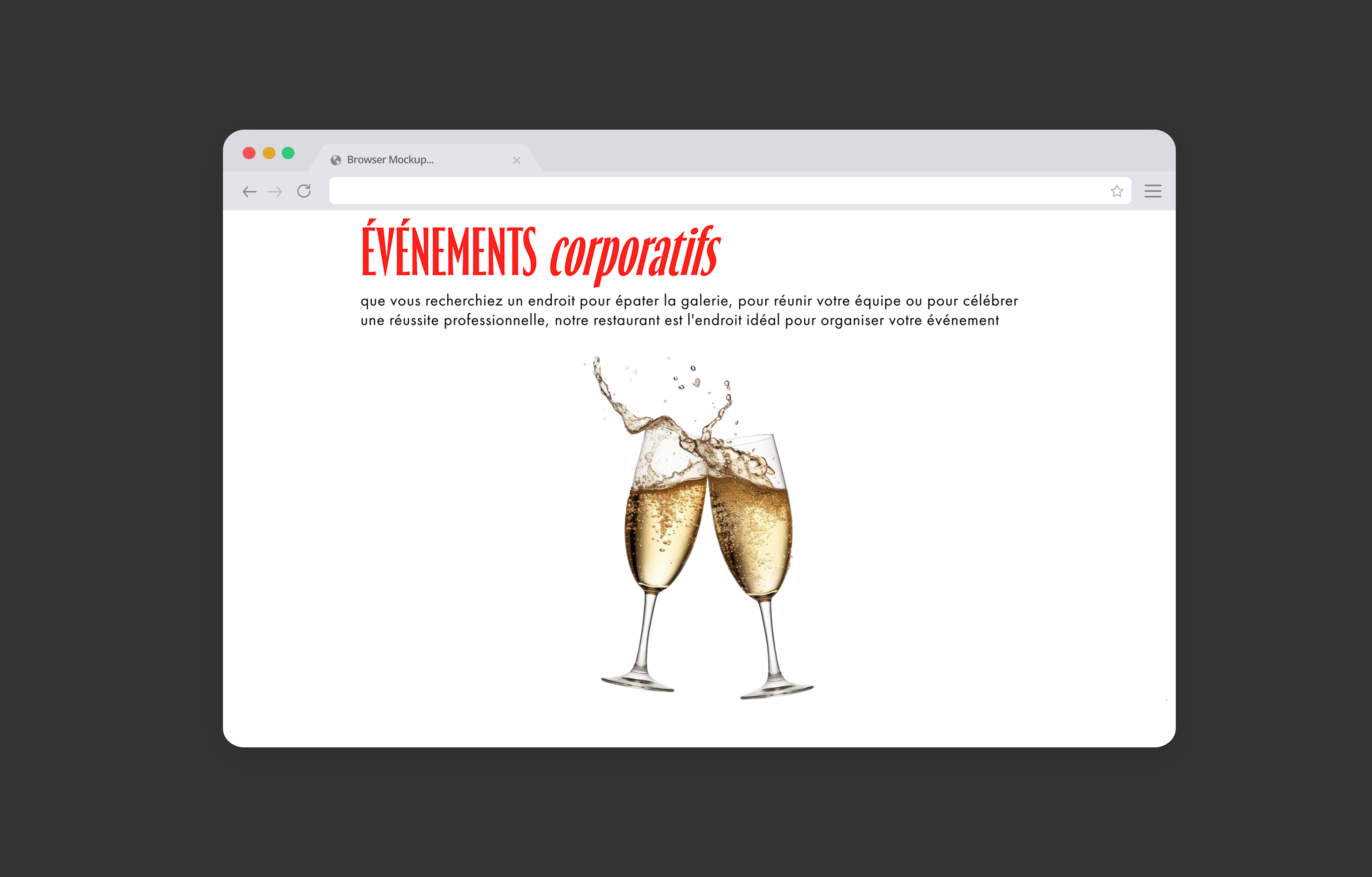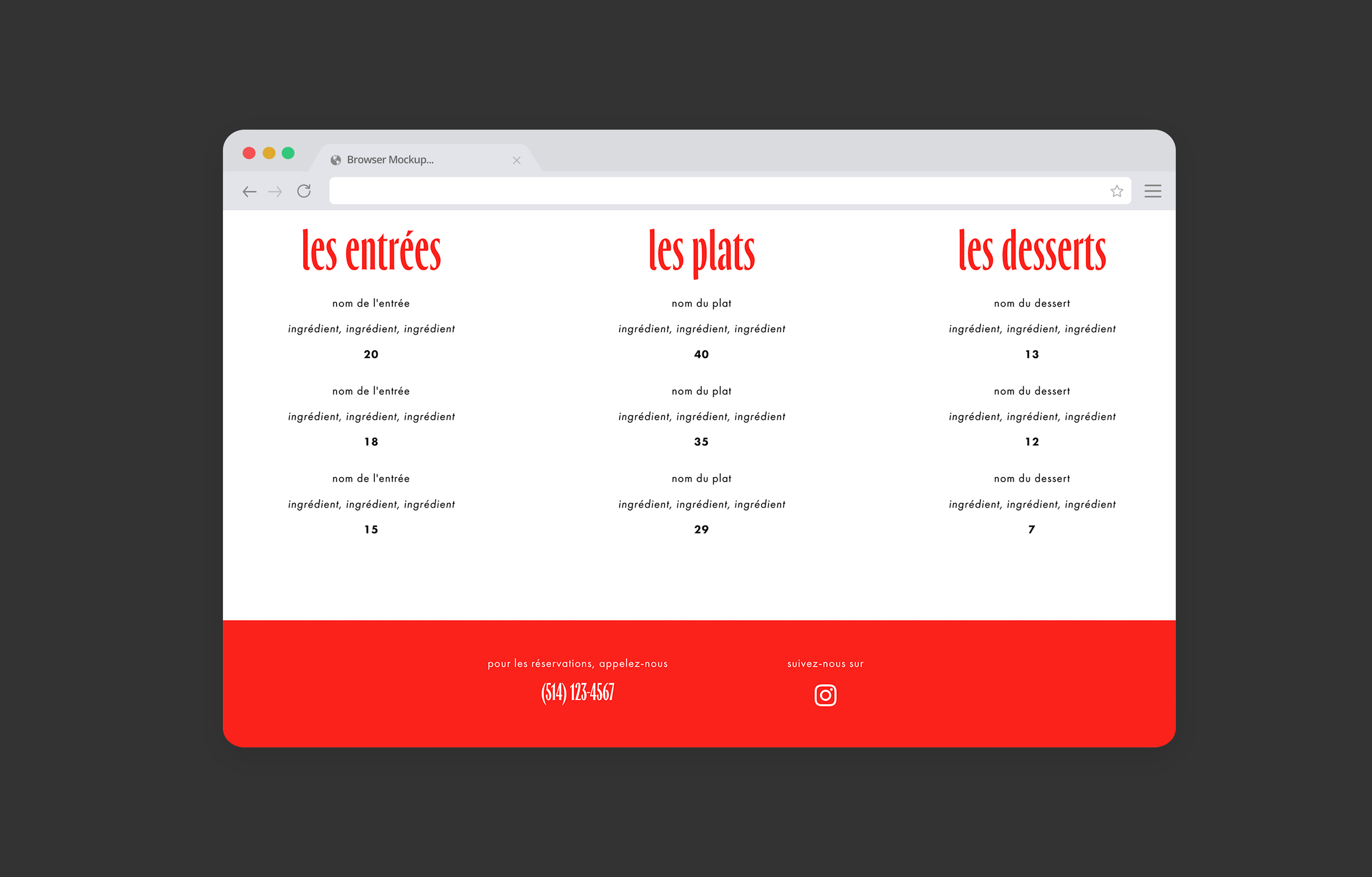
The project involved a logo design and a visual brand identity for SOKHA, a fictional Cambodian restaurant offering traditional cuisine in a sophisticated setting. The branding also includes a website that aligns with the restaurant’s modern and minimalist aesthetic, using vibrant graphics and a lot of negative white space.
The target audience for SOKHA includes urban professionals aged 25 to 45 who have an appreciation for high-quality dining experiences and cultural authenticity. This audience is composed of food enthusiasts who have an interest in Southeast Asian cuisine and are drawn to the unique flavours and culinary traditions of Cambodia. They seek an "Instagrammable" environment for dining, whether for casual outings, special occasions, or business meetings.
The logo design for SOKHA incorporates elements of the Khmer alphabet, which were creatively integrated into the typeface. This design choice not only enhances the visual appeal of the logo but also reflects the restaurant's deep connection to Cambodian culture.
A minimalist sans serif typeface, Futura, was chosen for its modern aesthetic, allowing the logo and content to stand out. The bold black and red colour palette creates a strong visual contrast. These design elements work together to reinforce the restaurant’s brand identity, making the website both visually compelling and aligned with SOKHA’s commitment to blending tradition with contemporary design.