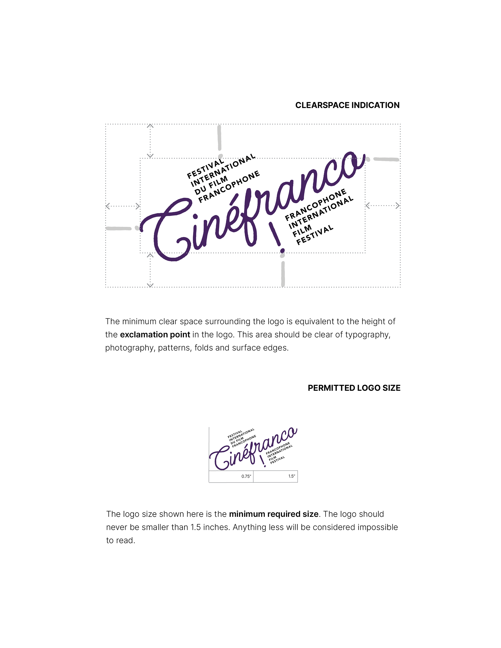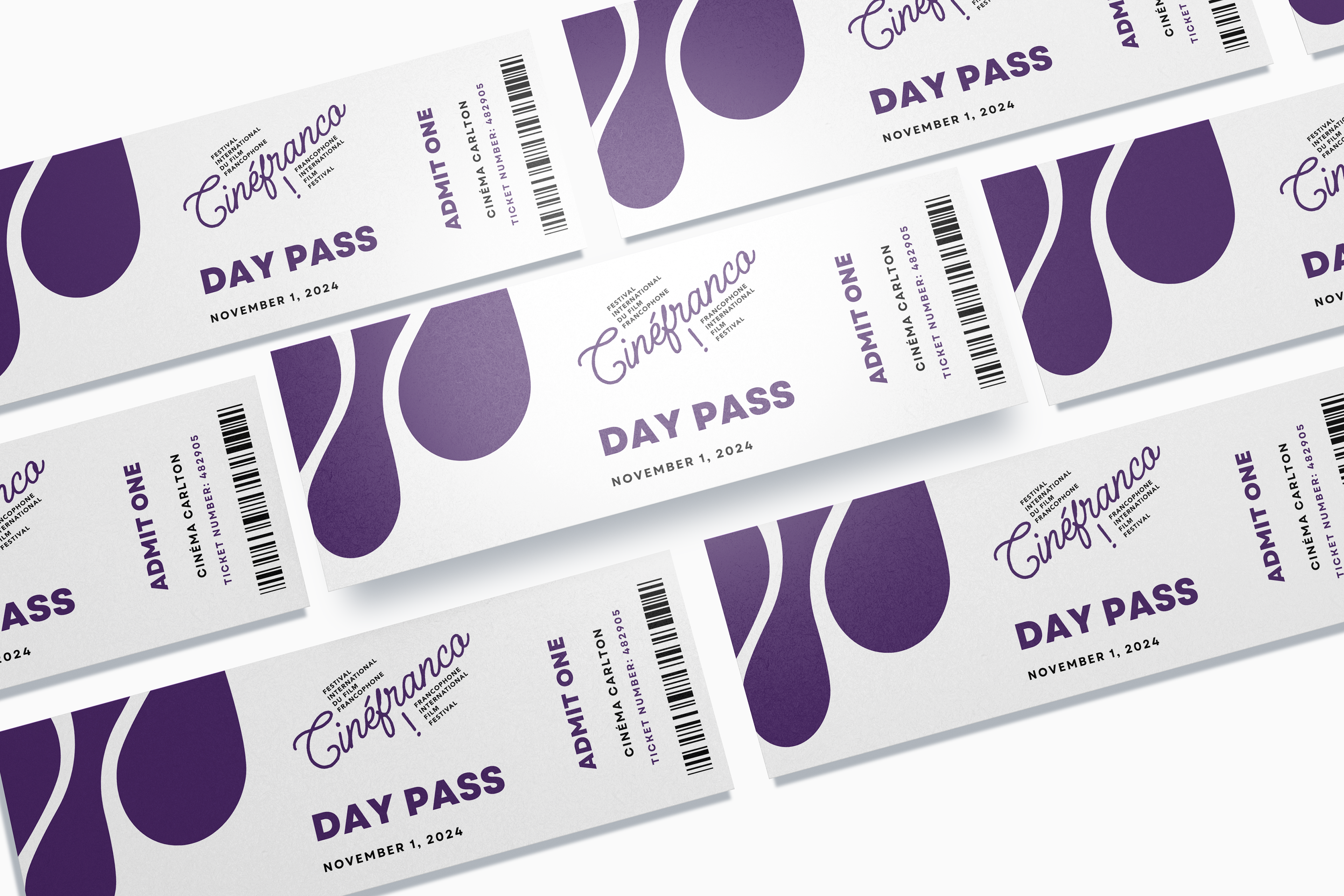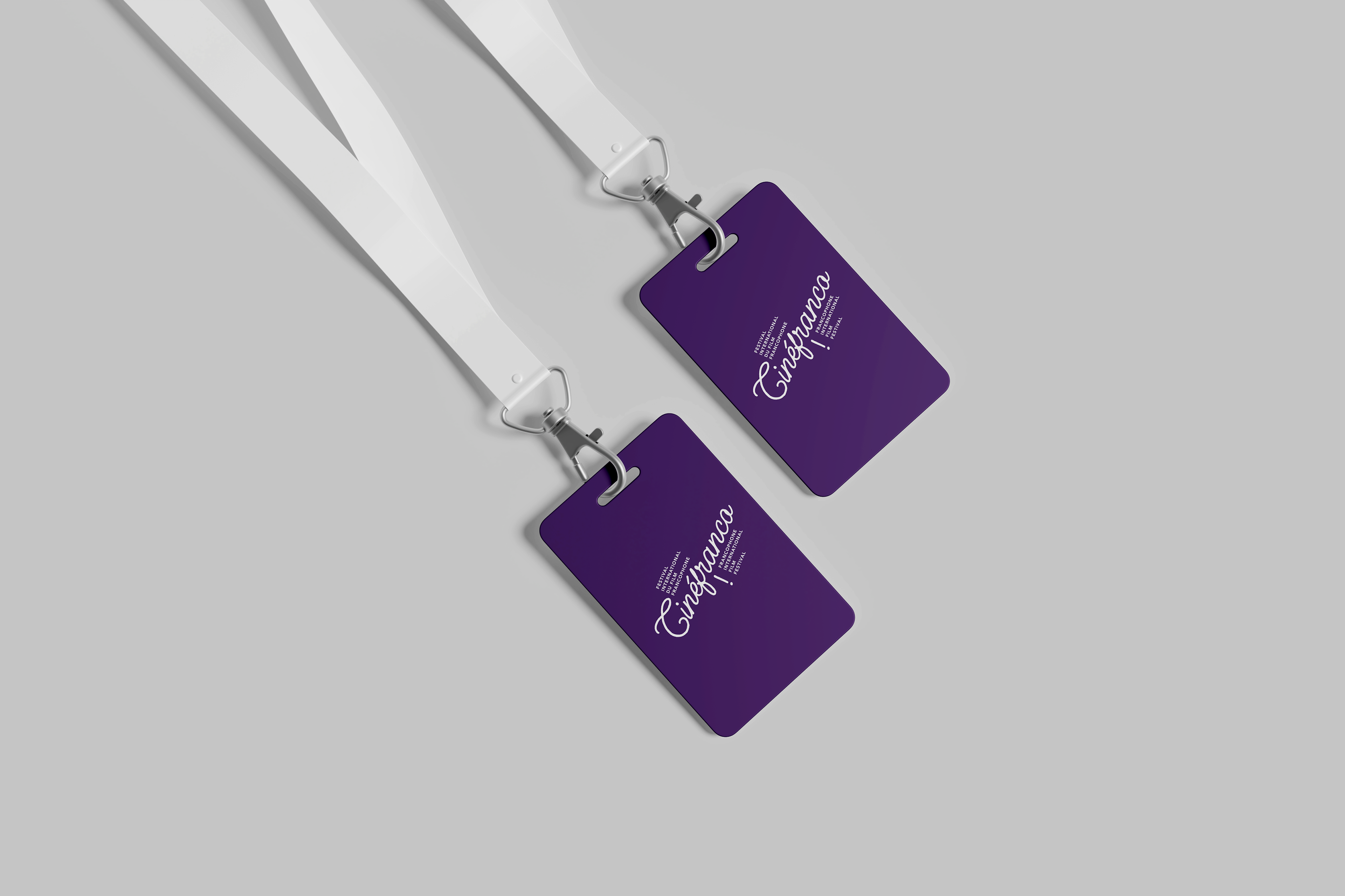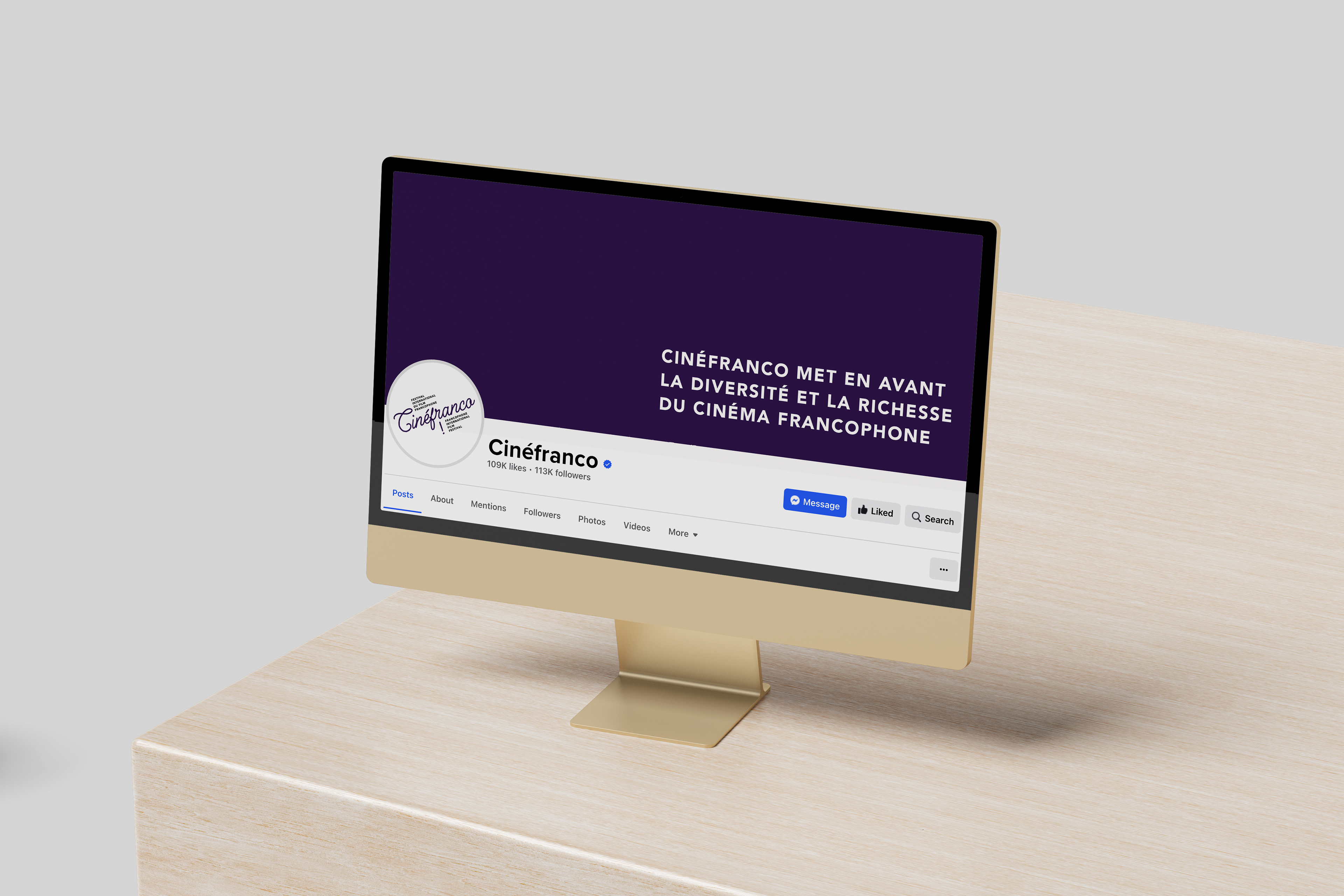
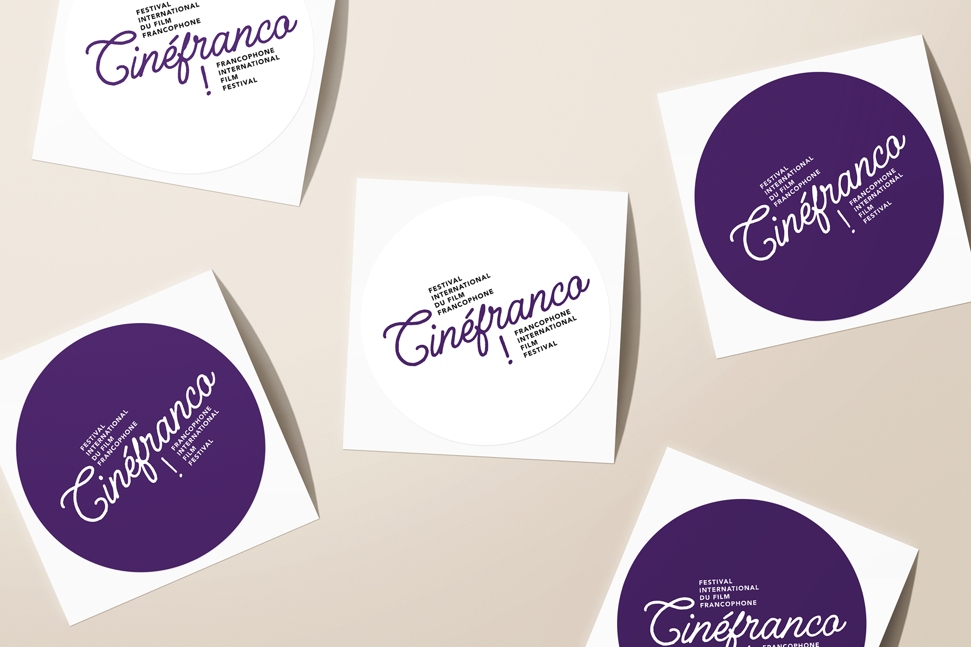
The project involved a fictional redesign of an event logo, encompassing various aspects of branding identity. The redesign aimed to revitalize the event's visual identity, incorporating a fresh logo design, typefaces, colour palette, clear space indication, minimum size specifications, correct and incorrect logo usage guidelines, and the creation of brand collateral to ensure consistent and impactful representation across all mediums. Extensive research into the event's history, target audience, and overarching goals laid the groundwork for the redesign process.
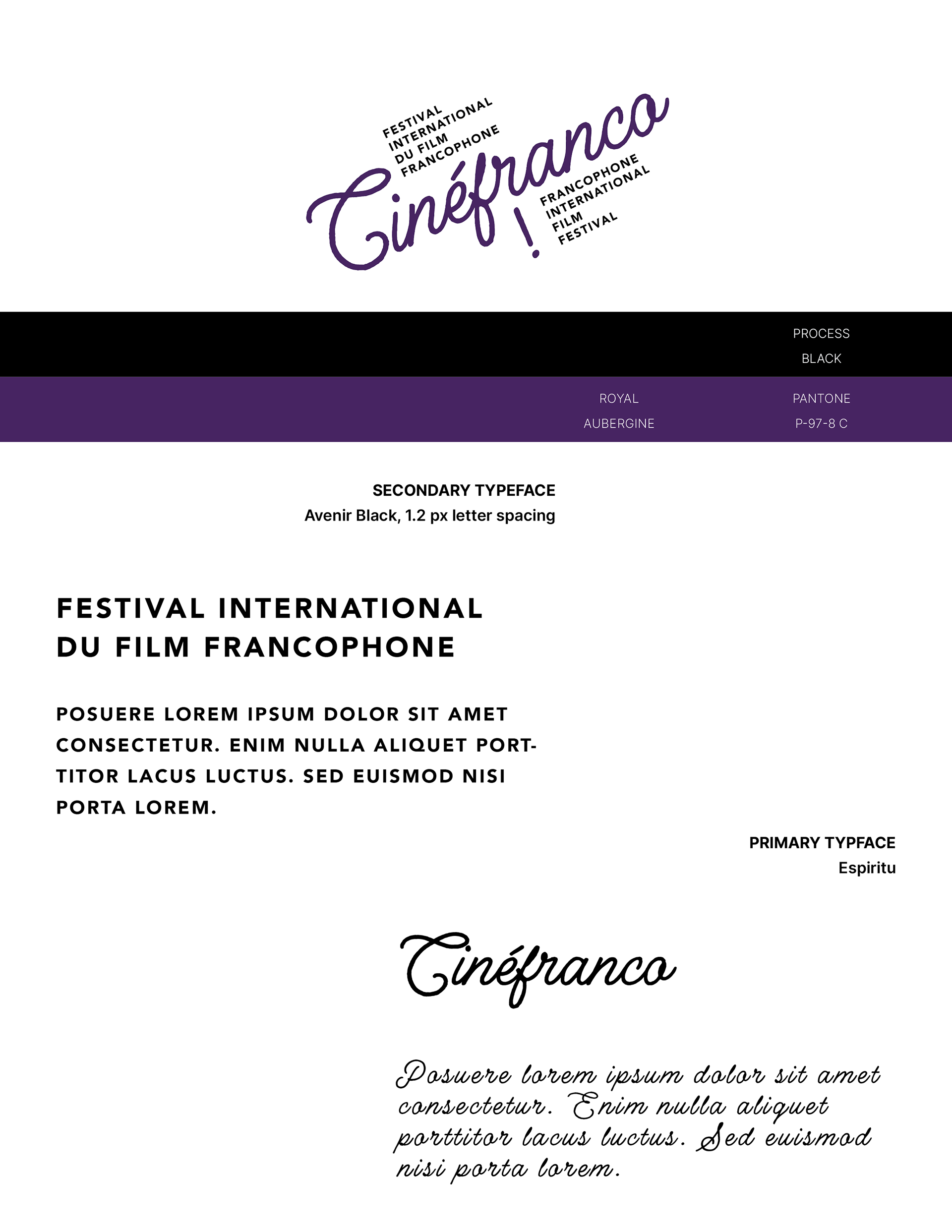
Multiple sketch iterations and concept explorations were conducted to arrive at a memorable logo that resonated with the event's themes and objectives. The careful selection of typefaces that complemented the new logo and an attractive colour palette was curated, reflecting the event's tone, personality, and appeal to its audience. Detailed brand guidelines were established, encompassing clear space indications to maintain the logo's integrity, minimum size specifications for optimal visibility, and guidelines for correct and incorrect logo usage across different mediums and platforms.